|
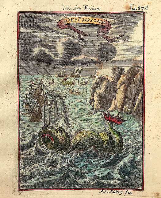
I regularly get map enthusiasts contacting me online about maps with said sea monsters or curious looking humans. The sea monsters especially, "have you still got that map with the sea monsters?" Usually the answer is no as these are so popular they get snapped up pretty quickly. The best I can often do is direct these enquiries to other reliable antique map dealers who may have some of these delightful maps and prints in stock. If its got sea monsters then it's most likely going to be a sixteenth or seventeenth century map. This was a time when many people believed that strange and dangerous monsters inhabited the oceans. Many of these maps carried the medieval fascination with monsters, some derived from the ancient Greek historian Herodotus. Above: "Des Poissons" by Alain Manesson Mallet c1684 from Volume I of 'Description de L'Univers' by Mallet. This work contains a wide variety of information, including star maps, maps of the ancient and modern world.
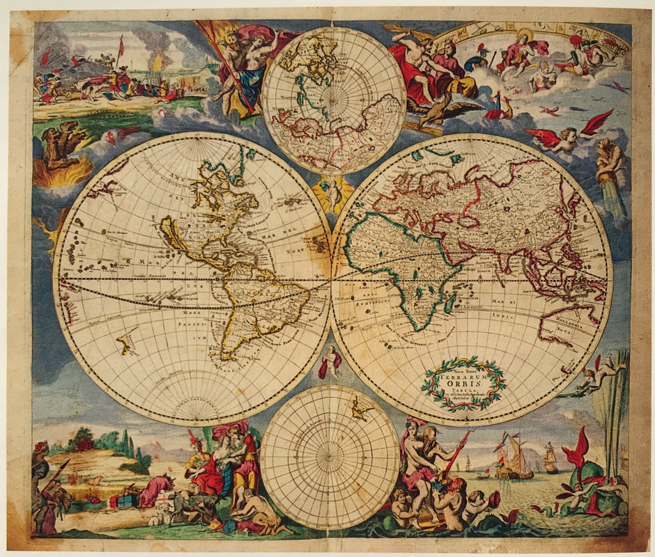
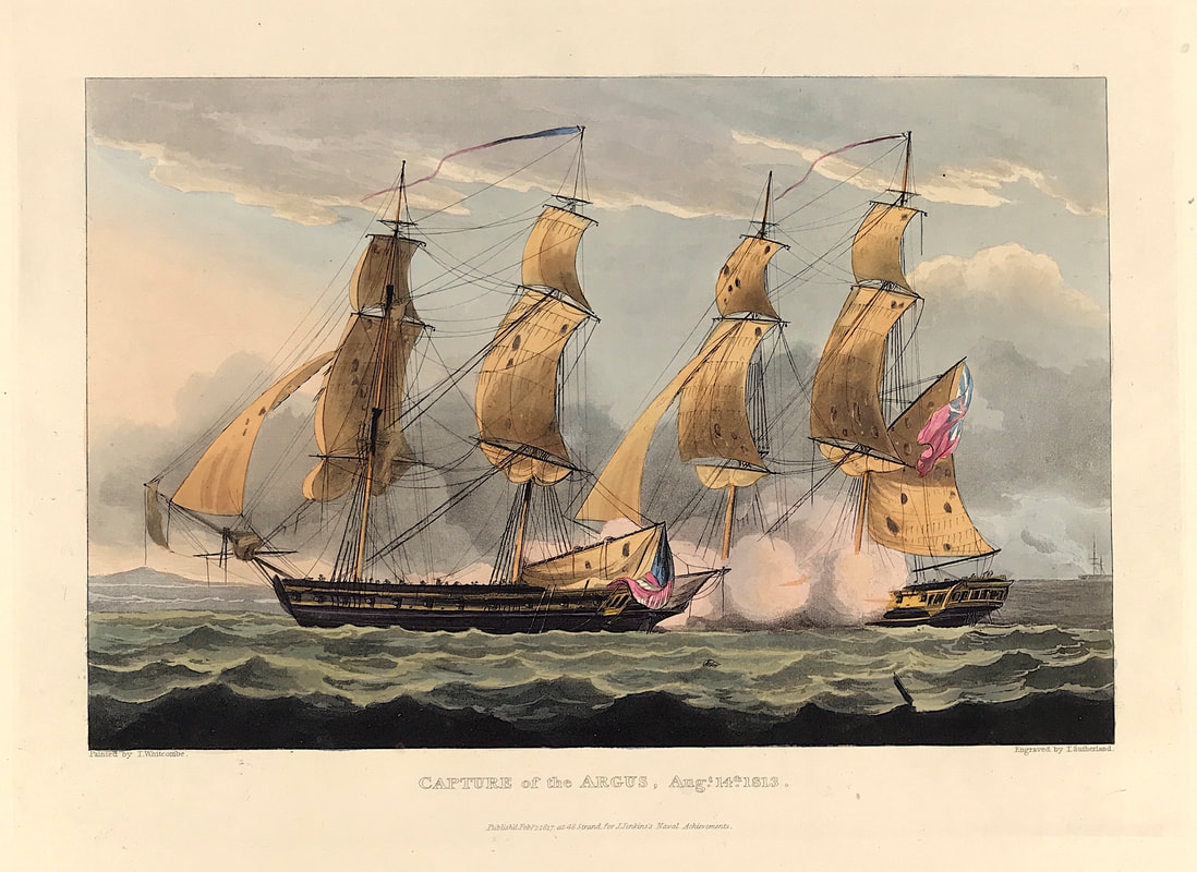
Herodotus spent his life traveling from one Persian territory to another. He crossed the Mediterranean to Egypt and traveled through Palestine to Syria and Babylon. He headed to Macedonia and visited all the islands of the Greek Archipelago: Rhodes, Cyprus, Delos, Paros, Thasos, Samothrace, Crete, Samos, Cythera and Aegina. He sailed through the Hellespont to the Black Sea and kept going until he hit the Danube River. While he traveled, Herodotus collected what he called “autopsies,” or “personal inquiries”: He listened to myths and legends, recorded oral histories and made notes of the places and things that he saw. So in the nicest way you can blame the sea monsters on Herodotus. These spectacular sea monsters clearly have links to real marine animals such as whales and walruses. These along with an array of fantastical creatures continue to captivate many map collectors. How about you? Lastly incase you're wondering about this delightful little sea monster print by Mallet, it's already been sold! Happy Hunting! Collecting Antique Maps - Does your penchant for embellishment drive you? More Tips for the Novice!10/16/2020 When it comes to collecting rare maps its often the embellishment on old maps that catches the eye and draws us in. My first maps as a collector were from the Blaeu family. I'm sure it was my fascination with the ornamentation that initially drew me in and before long I was hooked. I love to read and research so it quickly became evident to me that what was going on here was not just about art or decoration but visual messaging. Besides the map and geographical area being of interest these embellishments add to the story. Their used to enhance and convey messages on a number of levels. Mythology, allegory, emblems, power, the importance of local trade, naval battles, indigenous peoples, flora and fauna, sea monsters, sailing ships, customs, explorers, figures of importance, continents, gods and godesses, the heavens and planets to name just a few devices, all used to help convey the message. Above: Nova Totius Terrarum Orbis Tabula... Justus Danckerts (1635-1701) Atlas. Amsterdam: J. Dackerts. c. 1688. The Danckerts family were prominent print and map sellers active in Amsterdam for nearly a century. This map is embellished by four large lively allegorical scenes, representing the four elements. Top left fire is shown by war and destruction, top right air by the heavens, bottom left earth by harvesting and husbandry and bottom right water by ships and a spouting whale. There are groups of figures between the hemispheres and on either side of the smaller polar maps. HOW TO IDENTIFY: The embellishments say it all! Delightful maps like the one above by Danckerts and those of the Blaeu family I mentioned earlier are from whats known as the Golden Age of cartography c1550 - c1675. These are rich in cartographic ornamentation and remain popular with collectors. So if you're on the fence about what to collect maybe the embellishments on old maps will catch your eye making maps from the Golden Age the ones for you! Happy Hunting! Image Credit: Sotheby's Wardington Library 2005. When it comes to an illustrated record of British naval action there is only one and it's the desire of all naval history enthusiasts and antique print collectors. This is James Jenkins "The Naval Achievements of Great Britain. From the Year 1793 to 1817." These aquatint prints are prized by collectors. A key consideration for collectors is the quality of the colouring and these really are exceptional. If British naval history is your passion then these are the prints to collect. The importance of this work was aptly stated by Roger Quarm the curator of pictures at the National Maritime Museum in the introduction to the 1998 facimile edition "As a record of naval events spanning a period of over twenty years it has no precedent. At no time prior to 1817 had a publisher attempted such a complete volume of documentary naval prints. It is the quality of accuracy which makes Jenkins so valuable" Above: Capture of the Argus, Aug.t. 14.th. 1813. Painted by T. Whitcombe. Engraved by T. Sutherland. Publish'd Feb.y. 1. 1817 at 48 Strand for J. Jenkin's Naval Achievements. A naval battle scene showing the capture of the American brig Argus under the command of Lieutenant W. H. Allen by the British brig Pelican under the command of Commander J. F. Maples off St. David's lighthouse.
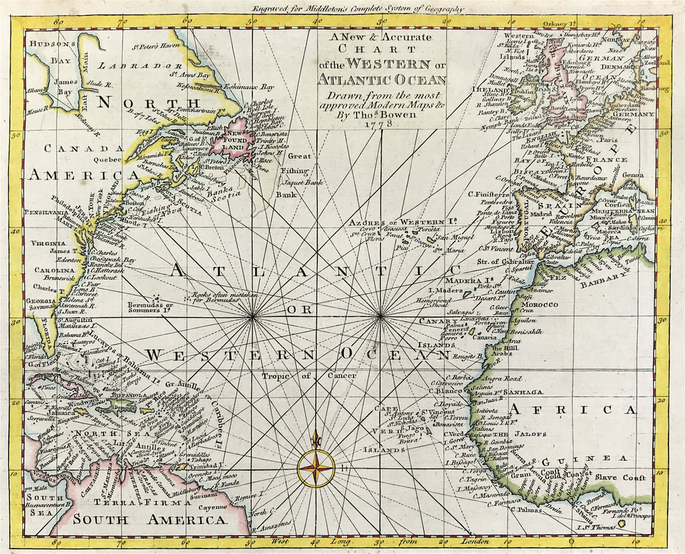
HOW TO IDENTIFY: The original prints from "The Naval Achievements of Great Britain. From the Year 1793 to 1817" are aquatint engravings on a medium weight wove paper. All the plates identify at bottom left Painted by T. Whitcombe and bottom right T. Sutherland (sculpt) who produced the aquatint engravings. Some plates were engraved by Jeakes and Bailey after Whitcombe. Each plate is accompanied by a text page describing the action, often with lists of ships captured or sunk, and excerpts from contemporary bulletins, dispatches, letters, and speeches. The first edition appeared in 1817. Early issues have watermarks of Whatman with the undated watermark IIS&S on some plates. The vignette title page was uncoloured in the first issue. The approx engraved image area of the plates are 7" x 10.25" (175mm x 260mm). Engraved plate mark area is approx 8.5 x 11.75 (215mm x 300mm). The folio sheet size is approx 11.5" x 14" (290mm x 355mm). Happy hunting! You can see more aquatint prints from Jenkins Naval Achievements HERE Collecting Antique Maps - Whats with all those lines? More Tips for the Novice Map Collector10/14/2020 Still on the subject of elements that make up a maps ornamentation that you should be aware of brings us to the matter of whats with all those lines? On your travels you will see maps similar to the example below. These fall into the category of sea or navigational charts. These maps showing large areas of the ocean and a particular coast line are very attractive and popular with collectors. Direction on old maps is indicated by means of a compass or wind rose, simple or elaborate in design, traditionally with north indicated by the use of of a fleur de lis and east by a small cross. So whats with all those lines? These are known as rhumb lines. In navigation, a rhumb line or loxodrome is an arc crossing all meridians of longitude at the same angle, that is, a path with constant bearing as measured relative to true or magnetic north. Above: Original Map of Chart of the Western or Atlantic Ocean by Thomas Bowen 1788. A New & Accurate Chart of the Western or Atlantic Ocean Drawn from Surveys and most approved Maps & Charts. Published: Middleton's Complete System of Geography 1788
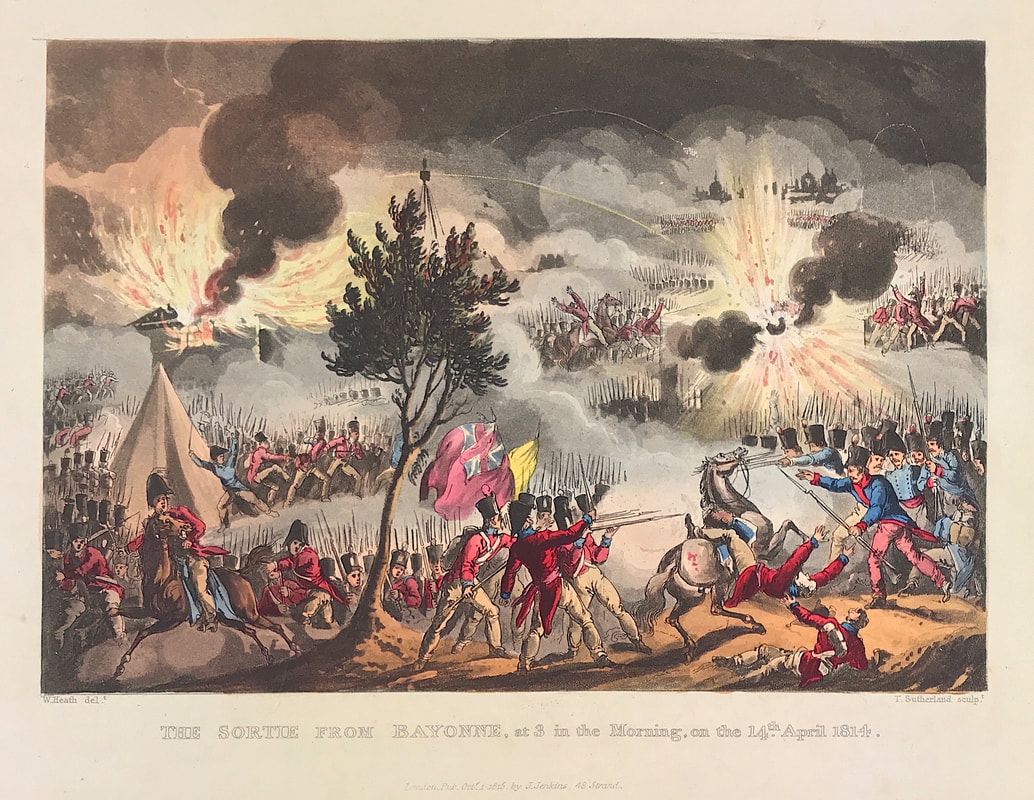
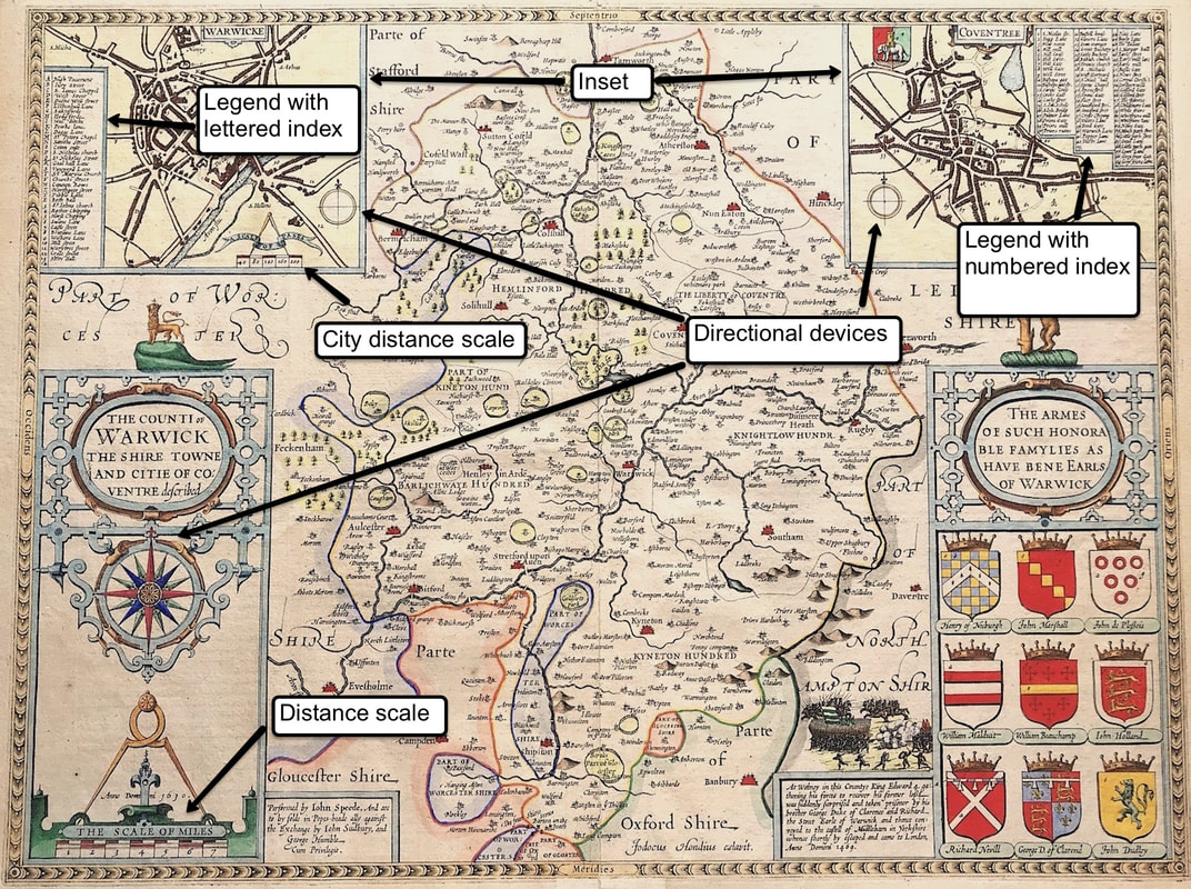
In this example you can see the rhumb lines radiating from the compass rose. You can see the fleur de lisat the top of the rose indicating north. East is indicated by the small cross to the right. On old sea charts the rhumb lines represent the bearings sailors used to navigate long ocean voyages prior to the invention of the chronometer. HOW TO IDENTIFY: Well you won't have trouble identifying sea charts or navigational maps in future These are the ones with the rhumb lines all over them radiating out from the compass rose! Happy Hunting! Click the link to continue to the next article in the Collecting Antique Maps series: "Does your penchant for embellishment drive you?" Military History in the United Kingdom emerged during the eighteenth century with studies of the Napoleonic wars, especially the Peninsular and Waterloo campaigns. This interest in armed conflict remains today, with stories of campaigns and battles and the continuing assessment of leaders, tactics and their strategy. Nowadays its defined as a humanities discipline and also remains popular with antique print collectors with a passion for military history, records of armed conflict and rare prints depicting battle scenes. One such campaign the Peninsular War is the military conflict fought by Spain and Portugal, assisted by the United Kingdom, against the invading and occupying forces of the French for control of the Iberian Peninsula during the Napoleonic Wars. Between 1808 and 1814, the British Army fought a war in the Iberian Peninsula against the invading forces of Napoleon's France. Aided by their Spanish and Portuguese allies, the British held off superior French numbers before winning a series of victories and driving them out. They then carried the war into France, playing an important part in Napoleon's first overthrow. Above: The Sortie from Bayonne 14th April 1814 from The Martial Achievements of Great Britain and Her Allies; from 1799 to 1815. The terrible night-time clash outside Bayonne on 14th April 1814, that marked the end of the Peninsular War, but occurred after the abdication of the Emperor Napoleon on 4th April 1814. The Battle of Bayonne of 14 April 1814 was a sortie by General Thouvenot's French garrison of Bayonne during the siege of that city conducted by Allied forces under Lieutenant General John Hope. Followed, after his wounding and capture, by General Howard, who commanded the British, Portuguese and Spanish Corps blockading Bayonne. HOW TO IDENTIFY: The original prints from The Martial achievements of Great Britain and Her Allies from 1799 to 1815 are aquatint engravings on a medium weight wove paper. Plates also exist that were printed on India Paper. They should clearly identify bottom left W. Heath (delt) who did the drawings and bottom right T. Sutherland (sculpt) who produced the aquatint engravings. Each plate has the date of publication and the name of the publisher beneath the engraved title. The approx engraved area of the plates are 8.5" x 7.75" (215mm x 195mm) including the engraved title text. Engraved plate mark area is approx 8.5 x 11.75 (215mm x 300mm). The large sheet size is approx 11.5" x 14" (290mm x 355mm). Happy Hunting! You can see the full details of the aquatint print 'The Sortie from Bayonne' from Jenkins Martial Achievements HERE In the last couple of posts I talked about a key feature of most sixteenth to eighteenth century maps the cartouche. There's a handful of other elements that make up a maps ornamentation that you will want to be aware of. Maps were made to different scales so it would be logical for there to be a ratio that compared the measurement on the map to the actual distance. These scales are normally shown by means of multiple scale bars for the units of measurement to the mile. Another feature is whats known as the 'Legend'. This simple device contains the explanation for symbols used on the map such as towns, roads, canals, rivers, forts, bridges etc. Many old maps have different symbols for the likes of market towns, cathedral towns and fortifications, within some legends there is a simple numbered or alphabetical index. Above: 'THE COUNTI OF WARWICK THE SHIRE TOWNE AND CITIE OF CO:VENTRE descibed' by John Speed c1611
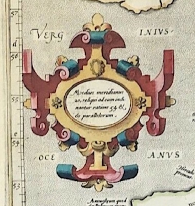
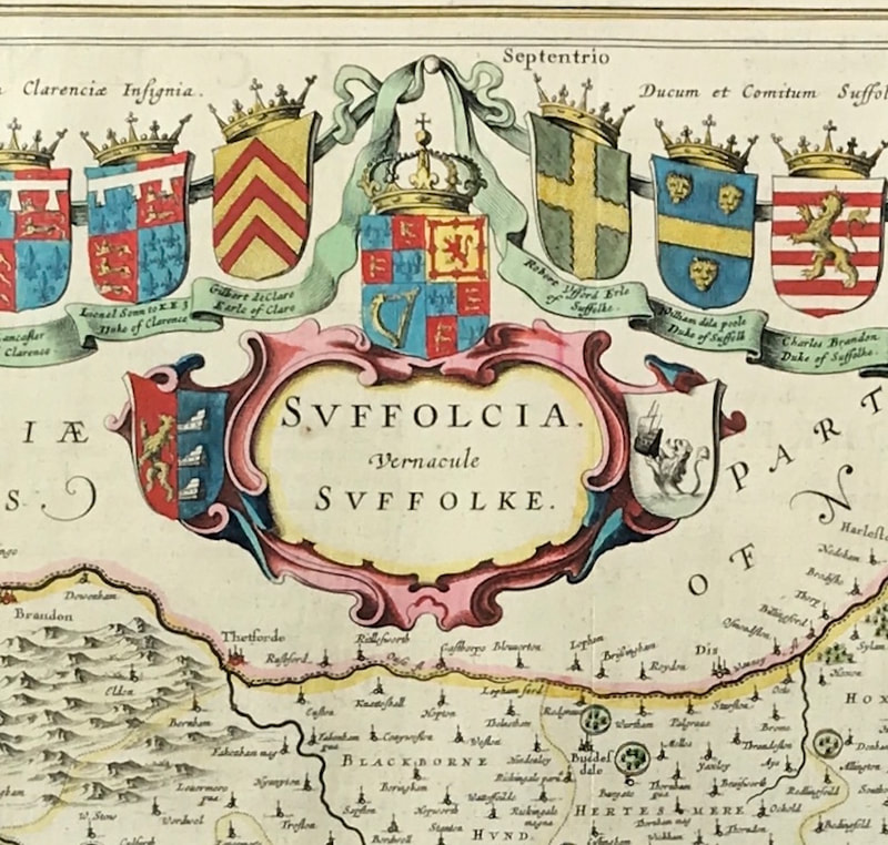
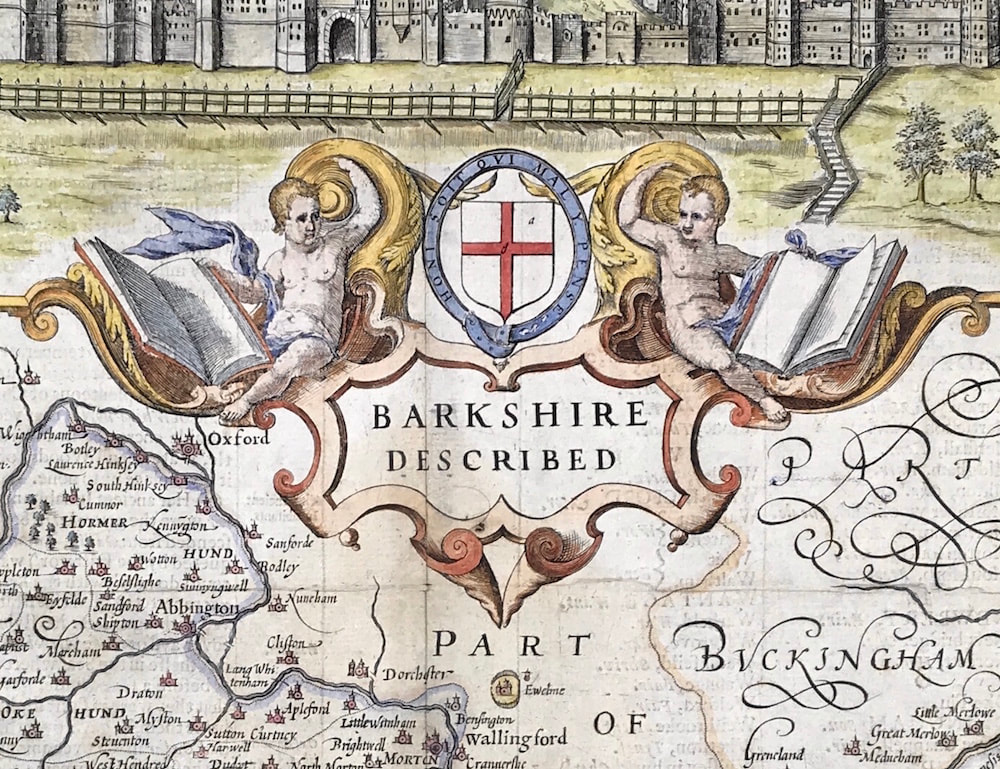
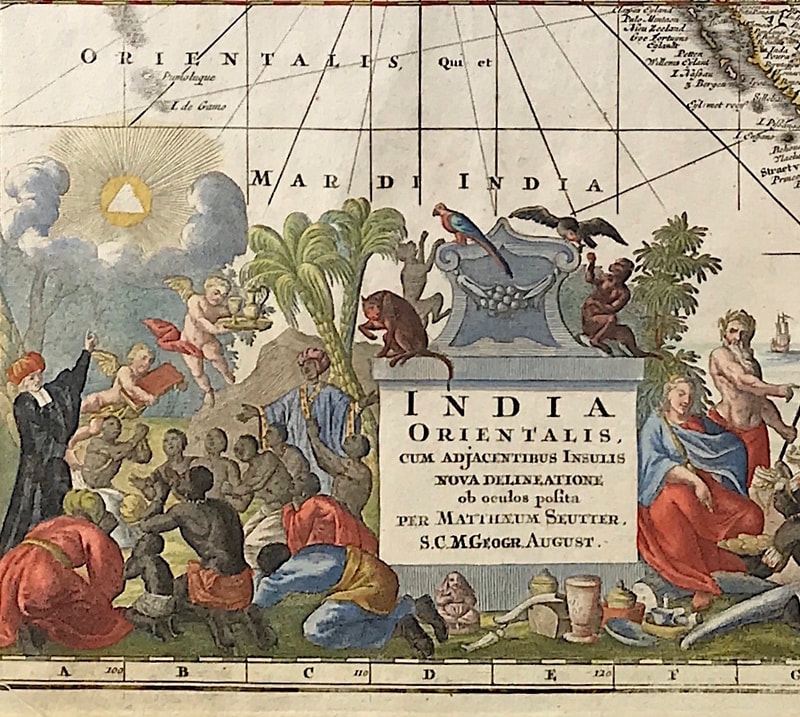
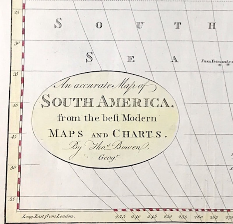
On the John Speed map above you can see on the left a simple legend box within the map inset for the City of Warwick. This has a simple alphabetical index identifying within the street plan certain buildings, streets, lanes, chapels and churches. The inset on the right for the city of Coventry has a similar legend, this time with a numbered index, identifying places and buildings within the city. Notice also that within both of the city insets at the top of the map and the larger cartouche inset on the left there are directional devices. A simple device within the top insets with a more elaborate directional device within the cartouche. In all cases north is indicated by the fleur de lis. Here's the Benefit? Getting a basic understanding of a maps anatomy so you're able to identify the ornamental parts that make up a map is essential. This knowledge will arm you with what to look for when it comes to helping you identify an original antique map, plus it may help you decide what type of maps you really want to start collecting. Click the link to continue to the next article in the Collecting Antique Maps series: "Whats with all those Lines?" Happy Hunting! Please share your experience and leave a comment below if you found this information helpful . . . In my previous 'Collecting Antique Maps' post I mentioned checking that the design style of the cartouche is in keeping with the period the map is claimed to be from. If you're looking to buy a sixteenth century map say by Abraham Ortelius could you instantly tell by the cartouche design on the map if the cartouche at least is looking right for that period? The more experienced you get at recognising cartouche styles the better. Just by looking at the cartouches below could you name the mapmakers? If you can't as yet, not to worry but the more you research and get familiar with the work of mapmakers the better equipped you'll become in identifying antique maps. You'll be a lot more confident when it comes to answering the all important questions - is it original, reproduction or even fake! Late 16C Mid 17C Late 17C Early 18C Late 18C In the above examples you'll see the cartouche styles changing faces over time. Using the maps of just a few well known mapmakers we start with the late 16th century. Then strapwork designs as they were known were generally representations of leather, parchment or metal bands interwoven sometimes with hideous fiqures or heads. Then by the mid to late seventeenth century a more Baroque style with mythological symbolism appeared and remained into the early eighteenth century. Now however the cartouches were generally uncoloured. By the nineteenth century cartouches were often nothing more than a simple oval or rectangle as the desire for more elaborate decoration was left behind. THE BIG BENEFIT: When you become familier with cartouche styles and designs you will notice that you can often identify a mapmaker simply on the basis of a cartouche design. Having a basic knowledge of cartouche styles from sixteenth to nineteenth century and the work of mapmakers of the period is a big benefit when you want to build a map collection. It's another piece in the jigsaw helping you identify an original antique map. So could you name the mapmakers? Late 16thC Mercator, Mid 17thC Blaeu, Late 17C Speed, Early 18thC Seutter and Late 18thC Bowen.
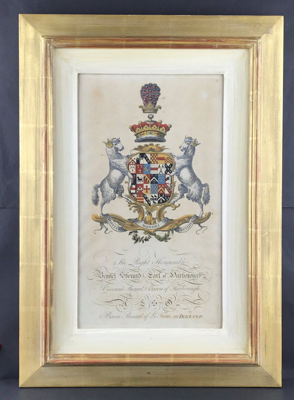
Click the link to continue to the next article in the Collecting Antique Maps series:"Whats with all that Ornamentation" Today reproduction coats of arms are sold by just about every online outlet as a quirky addition to your collection of home accessories. You've only got to type in 'coat of arms' to Amazon to see what gets thrown at you and I'm not going to elaborate. At a basic level a coat of arms is a shield with symbols, animals and colours that represent a family, person or group of people. Get the right thing and yes it can add to your decor. On a historic level heraldry originated in the devices used to distinguish the armoured warriors in tournament and war. It was also placed on seals as marks of identity. From the beginning there was a symbolic and decorative element in many of these devices, but the functional motive predominated. Over time this position has reversed. Modern heraldry is primarily symbolic and decorative and although it is still used on seals and in other ways, it is seldom solely relied upon to express identity. Thankfully the more serious heraldic print collectors are still alive and well. Early etchings and copper engraved coats of arms from the 18th century are very collectable. Heraldic Achievement's from Baronageium Genealogicum by Joseph Edmondson c1764 is a favourite and when accurately hand coloured in water colour in accordance with the Heraldic codes are some of the best. Above: An Original Heraldic Achievement from Baronageium Genealogicum by Joseph Edmondson c1764. The Right Honourable Bennet Sherard Earl of Harborough Viscount Sherard & Baron of Harborough. Bennet Sherard, 1st Earl of Harborough (9 October 1677 – 16 October 1732) Created Viscount Sherard in 1718, and Earl of Harborough in 1719 he was a British peer and Member of Parliament. This print is mounted within a custom made frame. HOW TO IDENTIFY:
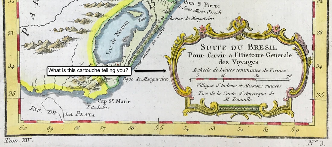
The original prints from Baronageium Genealogicum were copper plate engraved on hand laid paper. This kind of paper has a very distinct appearance and is identified by the visible lines seen in the paper when held up to a bright light. You can actually feel the lines and slight roughness when you touch this kind of paper. The original prints dimensions are width 10.75" x height 18”. If you find them coloured its good to check the colouring is correct in accordance with the Heraldic Codes. Most of this information is available online. Happy Hunting! You can see more Coats of Arms from Baronageium Genealogicum by Joseph Edmondson c1764 HERE - I have only a few! Collecting Antique Maps - Original or Reproduction - There's nothing new under the sun! Part 610/5/2020 If you've every been involved in advertising you'll know that to create an effective print advert you need to use your space wisely. You don't use every inch of white space just because you can. You leave some “breathing room” so people can digest your message. Early on mapmakers quickly realised that once the issue of scale had been addressed this was obviously going to result in some empty space appearing on the intended map in production. So like any good marketing push they set about filling such space with a variety of devices including cartouches, vignettes or insets. Collectively grouped we can refer to these as map ornamentation. This was presented in a way that wisely used the space available to capture attention and convey the message - There's nothing new under the sun! One such device is the cartouche. To quote Wikipedia "A cartouche in cartography is a decorative emblem on a globe or map. Map cartouches may contain the title, the printer's address, date of publication, the scale of the map and legends, and sometimes a dedication. The design of cartouches varies according to cartographer and period style." That just about covers it. Above: c1758 Jacques Nicolas Bellin "Suite du Brasil pour servir a l'Histoire generale des voyages : villages d'Indiens et missions ruinees, tire de la carte d'Amerique de M. Danville" (Continuation of Brasil to be used in the general history of travels: Indian villages and ruined missions, drawn from Mr. Danville's America map).
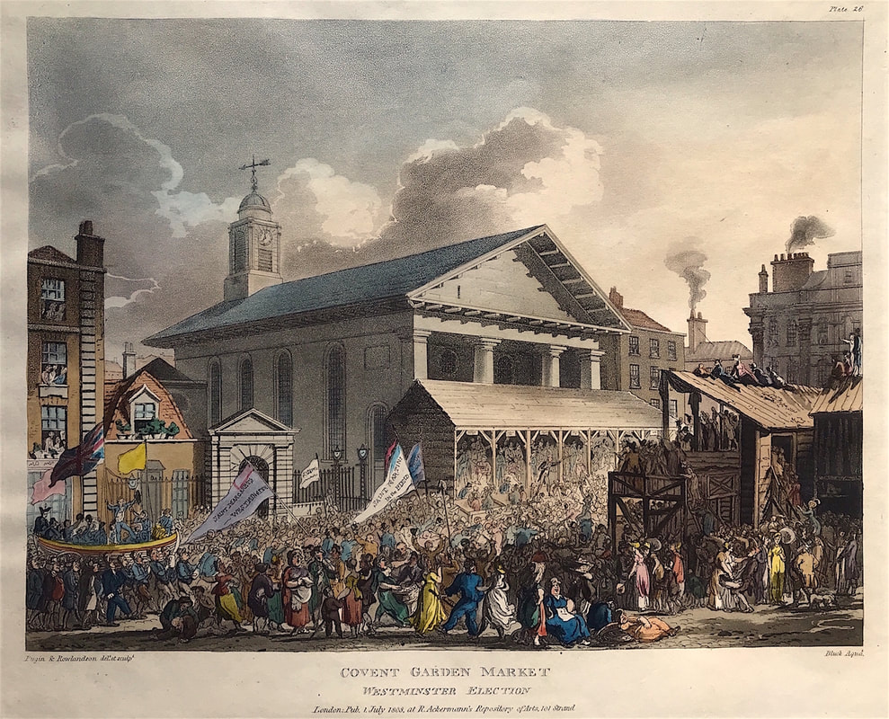
HOW TO IDENTIFY: It's good to examine the cartouche carefully, especially on early maps where they are more elaborate. what does it tell you? Is the design style in keeping with the period the map is from? But its not just about design style, often the official title of the map is found within the cartouche. Other useful information sometimes recorded within the cartouche will include the mapmaker, publisher, date and place of publication, a distance scale or a dedication. All this is important information helping you to identify the map and its originality. Happy hunting! Click the link to continue to the next article in the Collecting Antique Maps series: "Cartouches Changing Faces" Antique prints of historic London depicting well known scenes, landmarks, famous buildings and views are prized by rare print collectors around the world. The production technique also plays its part with collectors as individuals have differing tastes in the method used to produce such prints in the past. Some like to collect etchings or lithographs, others aquatints. Some prefer hand coloured coloured prints others uncoloured. All these issues are up for consideration when collecting. This is a view of the hustings in front of St Paul's Church, Covent Garden published in 1808. The throng of the crowds extending to scaffolds and roofs while listening to the candidates during the Westminster Elections. Parades with pennants showing the names of the parishes "St Margaret's Westminster" and "St Martin's in the Fields" can be seen in the foreground. The print was published in Rudolph Ackermann's famous work, the 'Microcosm of London', the figures were drawn by the famous caricaturist Thomas Rowlandson and the architecture by Augustus Pugin. Above: Covent Garden Market. Dated 1st July 1808 at R. Ackermanns Repository of Arts, 101 Strand. Published by Rudolph Ackermann in "Microcosm of London".
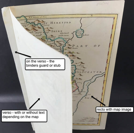
HOW TO IDENTIFY: Could you tell just by looking at this print that it's an aquatint? if you were able to enlarge the image on your desktop or laptop computer and you have some knowledge of prints you would likely answer "yes". Aquatint achieves gradations of tone through a very fine network, etched to various depths by the action of acid. The network entirely random in its patterning, encloses tiny islands of white. This really identify's this medium. You can see this clearly if you enlarge this image and examine the dark grey clouds immediately above the central rooftop. You can see more examples of the aquatint method from Ackermanns "Microcosm of London" HERE OK it sounds similar but these are two very different places! Previously I mentioned most antique maps were originally bound into books and atlases. A centerfold down the middle made this possible and the map was folded ready to be inserted and bound. So when you look at a map as in the example here the front of the map is often referred to as the 'recto' from the latin (Leaf), the front side of a leaf. The reverse or back of the page is known as the 'verso'. Thats it in map trade talk 'recto' the front side of the sheet with the image on it and the back is called the 'verso'. Often the verso will have text printed on it but this is not always the case. For the map to have been bound previously into an atlas it would need whats known as a binders guard or stub. This was simply a strip of paper glued to the back centerfold which enabled the binder to attach the map into the atlas or book. A simple stitching made this possible without damaging or leaving holes in the centerfold of the map.
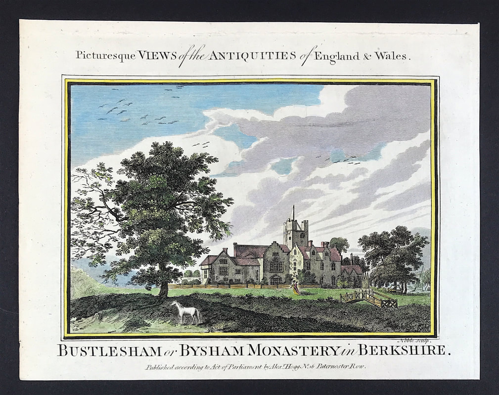
How to Identify: When it comes to the question is it original or reproduction all the points discussed to date can help you evaluate the antique map you're considering. As mentioned you want to look at whats on the paper, but even more importantly the paper itself. What does the paper it tell you? Is it laid paper or wove? This will help clarify does the paper fit with the claimed age of the map. What is the back of the map telling you? If possible, especially as a novice you want to try and get to see the maps 'in the flesh' as it were. There's nothing like seeing, touching and feeling these antique items. Once you're more confident you can consider distance buying online. But thats a story for another day. Happy hunting! Click the link to continue to Part 6 in the Series Collecting Antique Maps All around us are buildings that are historic and of local importance. Buildings may hold special historic interest because of a particular historical event or period, or they may be associated with nationally important people. England's historic churches, abbeys and monastery's are in this group and remain popular as places to visit and for antique print collectors. Bisham Abbey in the English county of Berkshire was once known as Bustlesham or Bysham Monastery which once stood alongside. The original Bisham Abbey was previously named Bisham Priory, and was the traditional resting place of many Earls of Salisbury. This 18th century view was published in "The Antiquities of England and Wales" Published by Alexander Hogg, London: No 16 Paternoster-Row 1795. First published in parts as - Historical descriptions of new and elegant picturesque views of the antiquities of England and Wales.
HOW TO IDENTIFY: These prints are copper engraved on 'hand laid' paper. This process involved a slurry being made from linen and cotton rags and each sheet of paper being made by hand. The slurry was spread over a handmade wire screen mold. This kind of paper has a very distinct appearance and is identified by the visible lines seen in the paper when held up to bright light. Often this can be seen even without such a light. You can actually feel the lines and slight roughness when you touch this kind of paper. The prints have an engraved image area of approx 7.5" x 5.25" (190mm x 135mm) and you should be able to see a clear plate mark surrounding the image and text. This print has later hand colour. When first published the prints were issued without colour. Happy hunting . . . You can see this and more examples of 18th century views of England in my etsy shop HERE |
LEARN ABOUT MAPS Where to Start? The Paper Earliest Maps Whats on the Paper? Rectum & Recto Marketing Devices Why Changing Faces? What is Ornamentation? Why all those lines? The Embellishment Story Illogical Prices Explained A Reference Library CLICK THE BOOK
Get the FREE Guide!
COLLECTING MAPS
Size Matters! Celestial Maps Strip Road Maps Sea Charts On the River of Life Projections The Sea Monsters Thematic Maps Town Plans Buy with Confidence. . .
More Top Tips for the Novice. Click the book to find out more . . .
COLLECTING PRINTS
Views of River Thames
Views of London Shipping & Craft Meet the Fairies Maritime Naval Military Battles Botanical Historic Churches Historic Views of Rome Archives
May 2024
|

